Going into the 2020 NFL season, six teams introduced new team uniforms, branding, and marketing campaigns that have generated a wide variety of reactions among influencers from the world of professional sports marketing. As an aspiring sports-business professional with a Master’s degree in Sports Administration from Northwestern University as well as several years’ experience working in the sports industry, I have analyzed and ranked these six uniforms in accordance with my own opinions as well as insights gathered from influencers around the sports industry.
(Note: click each photo to enlarge)
- Los Angeles Chargers
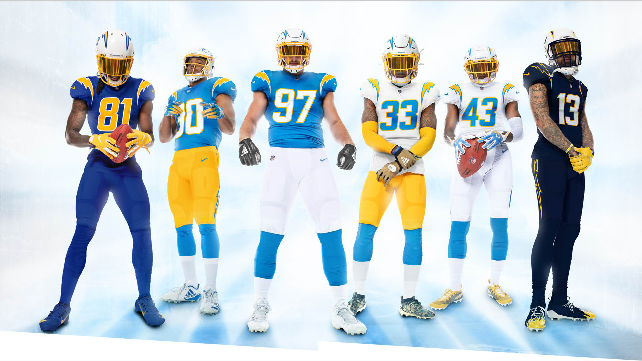
The L.A. Chargers have always had fantastic uniforms that tie in elements that make them unique: prominent lightning bolts and their signature powder blue color. This year, the Chargers went all-in on the powder blue and the results were spectacular. Paul Lukas, creator of the sports aesthetics blog “Uni-Watch” and one of the nation’s leading experts on uniforms in sports, analyzed the Chargers’ uniform unveiling in his April 2020 article “Bolt from the Blue: Chargers Unveil Sharp New Uni Set”. Lukas immensely praised the Chargers’ new threads, calling them “A big win… For their six decades of existence, the Chargers have been through several different uniform eras but have never had a bad uniform set. Not many teams in any sport can say that — well done”.
Lukas also hinted in the article to a possible new uniform trend for all NFL teams based on the fact that the Chargers’ new jerseys didn’t feature “TV numbers”, or, numbers on the shoulders. However, Lukas stated that although both the new uniforms released by the Chargers and the Patriots, which I will review later in this post, did not feature TV numbers, 29 of the league’s 32 teams still featured them – thereby nixing the possibility of a new trend.
Overall, I completely agree with Lukas’ analysis and trust his reputation as one of the nation’s leading sports uniform experts. The Chargers’ design is simple yet awesome – with a unique color scheme and timeless feel. These are hands-down the best new uniforms going into the 2020 NFL season.
2. Cleveland Browns
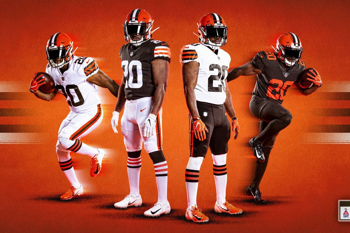
It’s difficult to follow up the beautiful LA Chargers’ uniforms in the rankings, but the Cleveland Browns’ new threads make an easy case for number two. The Browns retreated from (in my opinion, as well as many others’) one of the worst uniform sets in sports back to a timeless look similar to the ones that the team sported from the late 1980’s to 2014.
Connor Orr’s May 2020 Sports Illustrated article “New NFL Uniforms: The Definitive Rankings” also place the Browns’ new set at number two, right behind the Chargers. Orr explains that as a team with a unique color scheme (brown and orange) and rich football history, “reverting to a look that more closely resembles their last run of success in the late 1980s [is] wise. Timeless is always better”.
Additionally, Paul Lukas offered high praise for the Browns’ new uniforms, calling them “a huge upgrade”. Lukas does note, however, that the uniform set would be even better with the addition of orange pants. I completely agree with this, as the orange color can offer an even better contrast with the brown jerseys than white pants, in addition to taking advantage of their unique color scheme.
These uniforms are timeless, clean, and true to the Browns’ brand and history. They are an easy choice for number two.
3. Tampa Bay Buccaneers
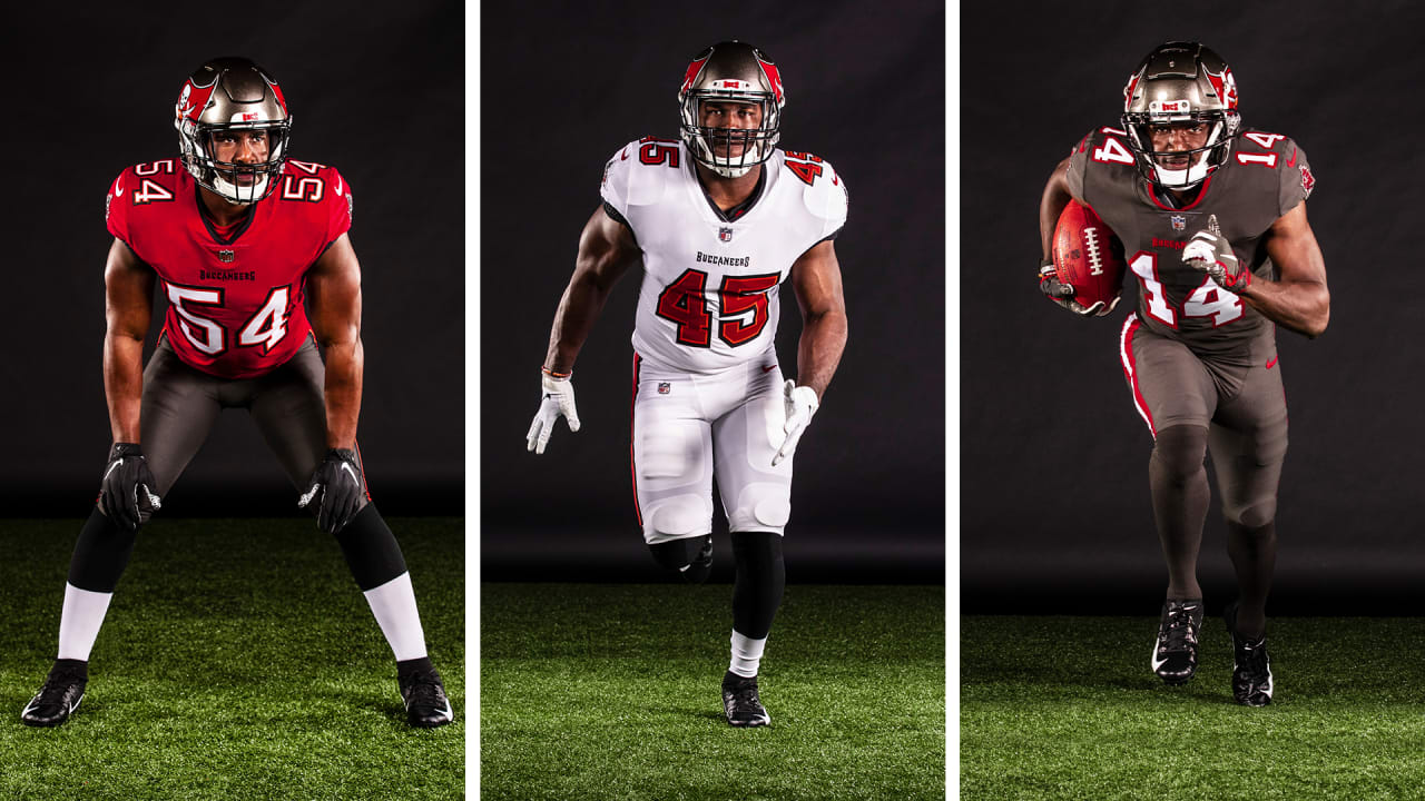
The Buccaneers followed the footsteps of the Browns by reverting back to a timeless look of their own. In doing so, the Bucs also ditched their own garish look, complete with “alarm clock” numerals, in favor of a sleeker, simpler design. The Bucs’ new uniforms closely resemble their look from 1997 to 2014, with a few minor tweaks.
The Bucs also introduced a new, all-pewter alternate uniform set, which is a good one, but not on the same level as their primary home and away uniforms. Uniform expert Paul Lukas commented, “it’s obviously way better than what they’ve been wearing for the past six seasons. It looks like a football uniform, not a costume”.
Overall, this is a very solid uniform set. Just like the Browns, the Buccaneers abandoned their atrocious, costume-like “modern” uniforms in favor of a timeless, clean look that never should have went away in the first place.
4. New England Patriots
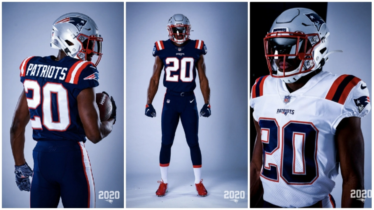
After the departure of longtime quarterback Tom Brady (who left for Tampa Bay and will be the franchise’s first quarterback to wear their updated uniforms), the New England Patriots thought it would be the perfect time to introduce new uniforms. Well, kind of.
For their new home uniforms, the Patriots took their current “color rush” alternate blue jersey and declared it their new primary home jersey. To complete the look, the Patriots brought in blue pants with red and white stripes down the sides. For the road uniform, the Patriots created a white version of the new blue home jersey to go with the same pants. The team retained their iconic silver helmets.
Overall, the uniform is good but not great. There were several missed opportunities for the Patriots’ uniforms to go from just good to one of the league’s best. First, there should have been white pants to go with the home blue jerseys, creating more contrast and avoiding what Paul Lukas calls the dreaded “leotard effect”.
Additionally, the white jerseys could have been improved if the shoulder stripes were inverted to have blue stripes on the outside. That would have created better contrast and really make the design pop more.
5. Los Angeles Rams
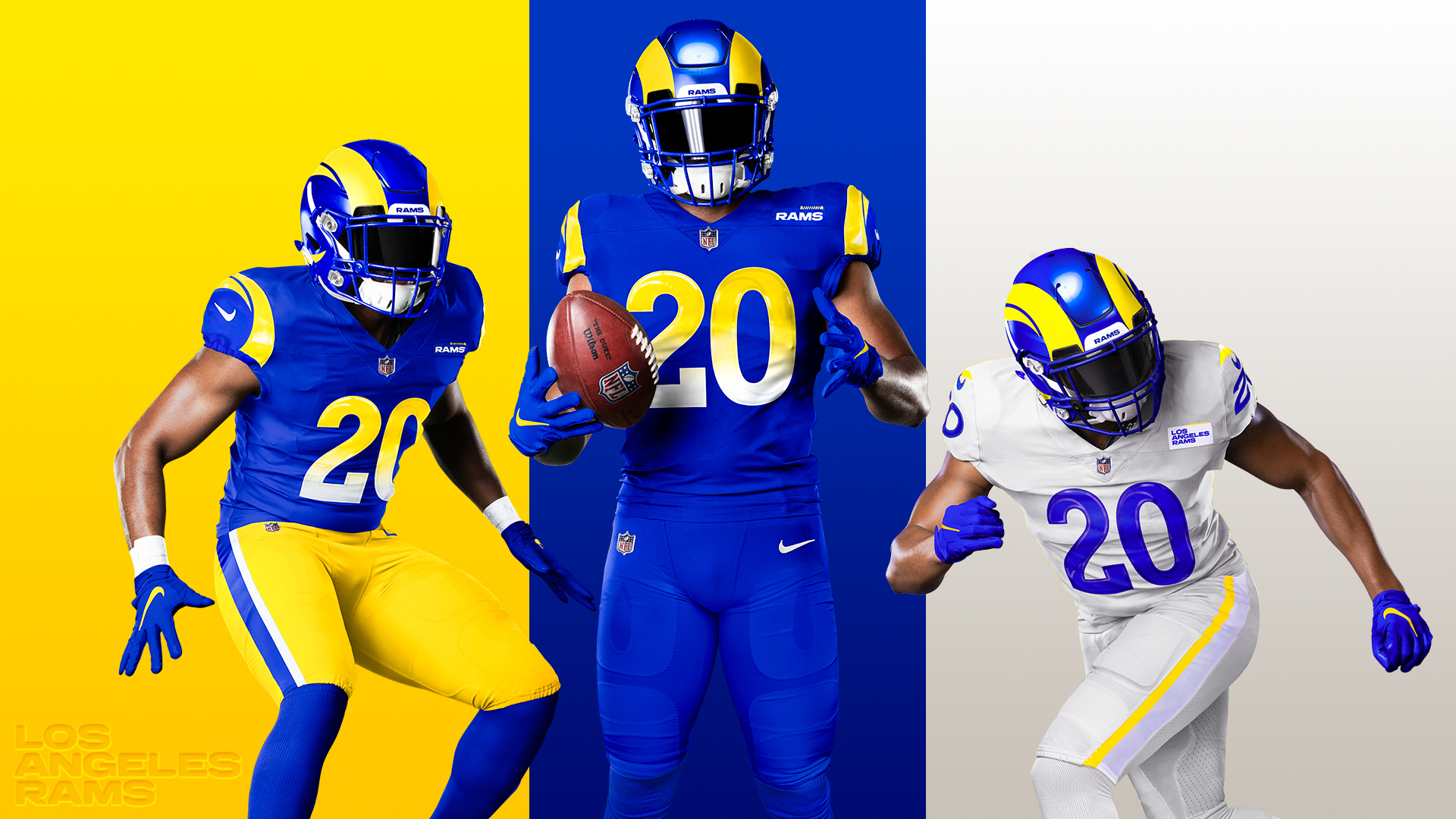
I have no idea what the Rams were thinking here. The Rams moved away from one of the league’s best looks, featuring several timeless uniform elements such as horns around the sleeves and helmets, to go bold with something new.
Man, did it backfire.
As the NFL continues to evolve in the modern world of social media, teams will try to appeal to younger audiences with ‘edgy’ or ‘bold’ new looks. However, new is not always better. Their new uniforms barely resemble what the majority of NFL fans know as the Rams, and their iconic look is no longer there. While some of the uniform elements from previous years make it to the new set, including their iconic blue and yellow color scheme, they are overshadowed by many more poor aesthetics such as gradient numbers.
The Rams had the chance to follow the footsteps of the Brown and Buccaneers by reverting to a classic look, but they chose to go in the complete opposite direction. And it was not a good choice.
6. Atlanta Falcons
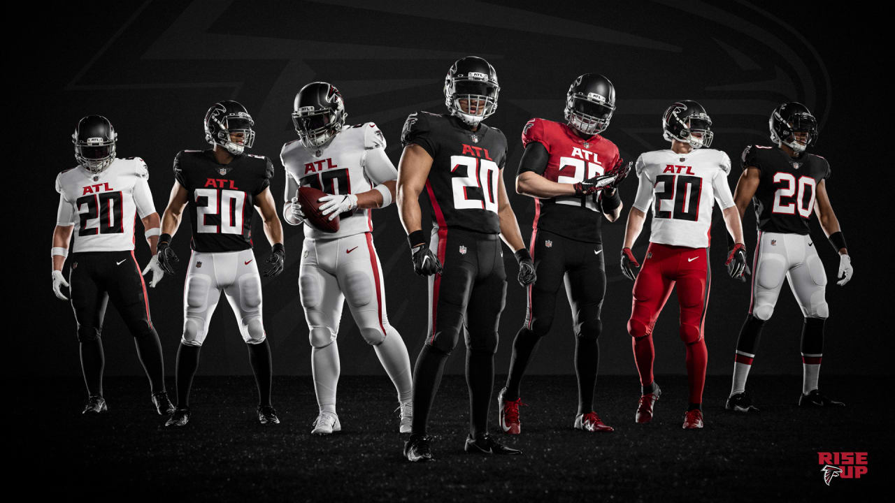
How do you make a mediocre uniform set worse? Just ask the Atlanta Falcons.
I have nothing positive to say about the new home and away sets. The oversized “ATL” on the chest is unnecessary and seems out of place. The red text on a black jersey is difficult to read. The numbers are also oversized and while I do appreciate the team’s unique font, they are too big to be aesthetically pleasing. The alternate red-to-black gradient uniform is atrocious.
The one positive, though, is that the Falcons retain their classic “throwback” alternate uniforms, seen on the far right of the graphic. These are simple yet awesome, a timeless and beautiful look, an extremely popular with fans. The Falcons missed a major opportunity to promote their iconic alternates to their primary uniforms and create a corresponding road set, which would have been a huge hit with football fans everywhere.
However, the beautiful throwback alternates were not enough to place the Falcons any higher in the rankings. Just like the Rams, the Falcons ignored a popular iconic look in favor of a forward-thinking, bold new set in an attempt to appeal to younger crowds. In doing so, they downgraded their uniform sets in an extremely detrimental way.
Having now read my own definitive rankings, I encourage you to take the following actions:
- Analyze all six uniforms
- Take a look at the images and form your own opinions on them.
- Rank them 1-6
- Determine your own rankings of 2020’s new NFL uniforms.
- Share your rankings on social media
- Share your thoughts with your friends and family and encourage them to create their own rankings. Then debate your rankings with one another.
In conclusion, ranking uniforms can be a subjective process with no right or wrong answer. However, listening to influencers and experts such as Uni-Watch’s Paul Lukas, we can determine what creates a popular and aesthetically pleasing uniform, in addition to seeing what trends are forming in the sports industry.
Daniel Sagerman is a former Media Relations Intern for the Chicago Dogs Baseball Club in Rosemont, Illinois, and a former Athletic Communications Assistant for the Northwestern University Department of Athletics. Sagerman is a two-time graduate of Northwestern, earning a Bachelor’s in Economics and Business Institutions and a Master’s in Sports Administration. Sagerman aspires to be a sports executive, and Northwestern University Professor Randy Hlavac’s Social Media Marketing Certificate program will play a crucial role in his career path.
